Craft Your Own AI Dashboard
Designing a holistic, consumer-grade experience for no/low-code AI/ML app creators — not just expert data scientists.

Challenges
Uptake had already proven it could deliver value in industrial AI, but the product suite had grown fast and in silos. Leadership saw an opportunity to consolidate and expand before competitors moved in. The pressure was real: build something consumer-grade, approachable, and extensible without losing the trust of the expert users already inside the platform. The culture matched the moment. We weren't chasing perfection; we were chasing progress.
Objectives

My Role
I was a senior visual designer on the platform team, but my biggest contribution wasn't any single screen. It was advocating for a shift in design philosophy. Uptake had historically optimized for its most expert users. To reach a broader audience, I pushed consistently for more clarity: more negative space, less visual noise, and data visualizations that earned their place rather than existed for their own sake.
I wanted someone opening the product for the first time to feel oriented, not overwhelmed. That tension between power-user depth and first-time approachability shaped nearly every decision I made on the App Studio.
User Journey
Discovery
A senior interaction designer and I were assigned to the App Studio experience and improving onboarding. We jumped straight into wireframing, rapidly iterating toward the simplest, most user-centric flow and building a hub to anchor all the other experiences.
Marcus was our litmus test throughout. Every time we added a configuration option, I'd ask whether someone running a fleet of trucks would know what to do with it. That pressure kept us honest — it's why we committed to negative space over density, and why the page-based mental model resonated. It matched how operations managers think, not how data scientists build.


Improving Onboarding Experiences


The A/B test taught us something important: our expert users weren't exploring the platform from the outside in. They came in already knowing where they were headed. That freed us to simplify the entry point dramatically, removing the resource-heavy onboarding content that felt helpful in theory but added friction in practice. The cleaner login wasn't just an aesthetic call; it was the right one for how our users actually behaved.

Application Users
A P P B U I L D E R S
Creating a Simpler, More Friendly Hub
I was asked to create an "ideal" state for the app suite.

The Application Studio
These are screens I designed to guide users into the App Studio. As users started building more apps, feedback revealed that they liked thinking in pages, so we created a list view for monitoring each page within their new app.


As users started building more apps, feedback revealed that they liked thinking in pages — so we created a list view for monitoring each page within their new app.

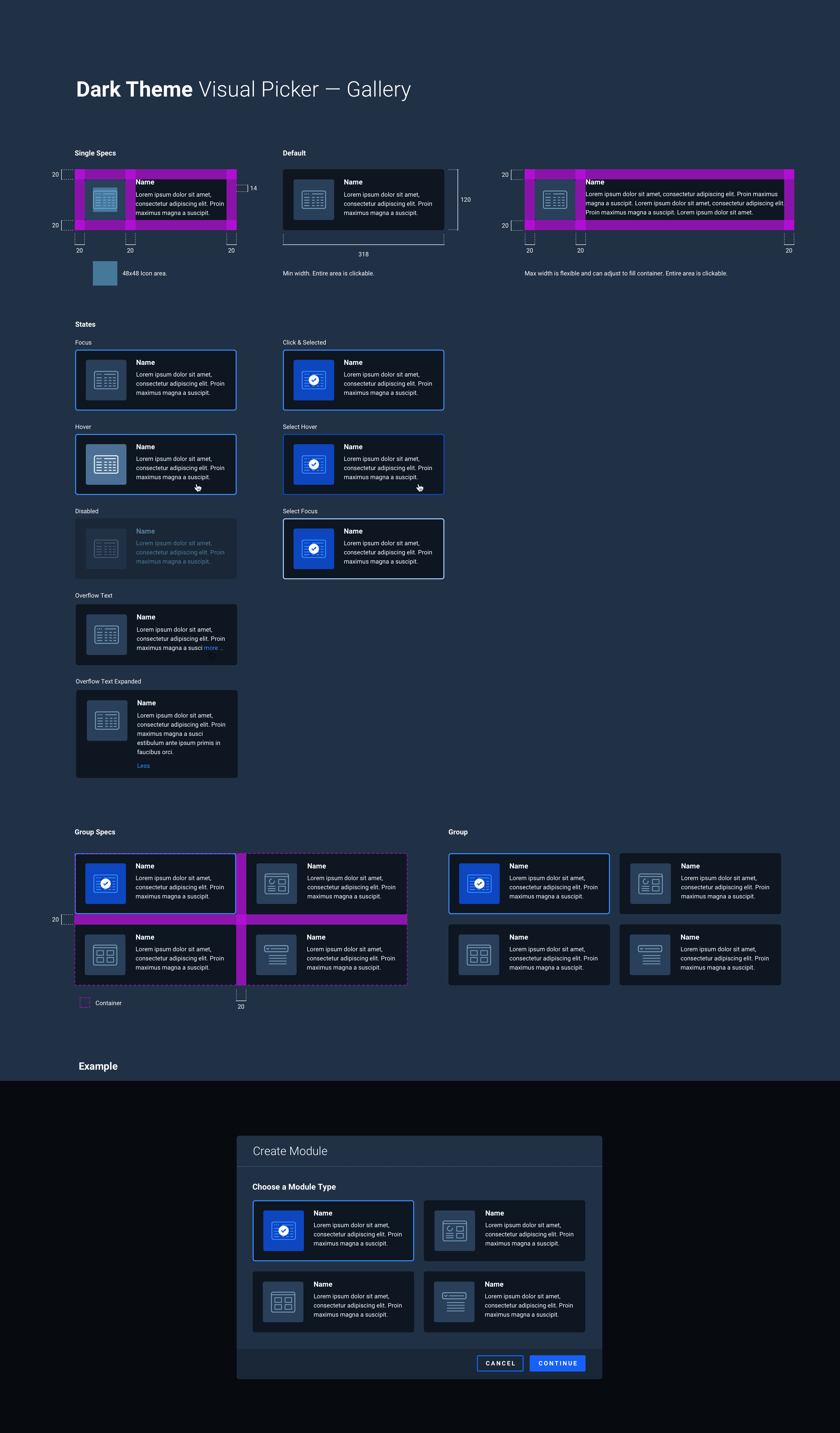
Page Creation Modals


Version 1: Proto App Studio
V1 wasn't really a product. It was a question: could we render live machine data in real time, and could we do it fast enough to be useful? Once we had our answer, the limitations became obvious quickly. A single-widget POC proved the concept but exposed how far we had to go for real app-building behavior.


Version 2: Thinking in Slots & Config Panels
V2 came directly out of watching how people actually assembled apps, and it was illuminating. Lists needed better scroll handling. Contrast wasn't always accessible. Some components weren't sized to nest properly inside others. V1 stress-tested the system and showed us exactly where it broke. V2 was us taking those cracks seriously.

Once we could render individual widgets, it was time to think in slots, measure performance across multiple rendered components, and build out a configuration panel on the right. From there, we added the rendered chrome of an individual app page — header, subheader, background, and more. We then added the ability to customize app styles, make all components draggable, and preview the result.


Expert App Builder
Evolving to a Robust Canvas Experience
As the App Studio matured, a new need emerged. Data scientists wanted more freedom to customize components and a more open way to lay out their workflows and data science pipeline journey maps. This led us to design a more fluid canvas experience. We advanced the canvas to support zooming and expanding for linking across app pages.


We advanced the canvas to support zooming and expanding for linking across app pages.


Outcomes
It All Happened So Fast
A C H I E V E M E N T S
Rapid App Studio launch: We shipped the App Studio in sprints, not quarters or years
Immediate user feedback: The App Studio was adopted right away, generating a steady stream of feedback back to the team
UI contributions to the design system: Drawing on my background in the design system, I was able to build new components and contribute them back for refinement
Real-time dashboards and predictions: Time-series charts, threshold bands, status badges, histograms, and sparklines — all customizable by users
H U R D L E S
Working with limited research time meant we had to be disciplined about which assumptions were safe to act on and which needed validation. When the light/dark theme conflict started creating jarring moments in the UI, I flagged it early as a coherence problem, not just a visual one. Mixed paradigms erode trust, especially for users who are already skeptical of AI outputs.
We established clearer rules for when and how each theme applied, which gave the platform a more intentional, considered feel. Building an app that builds apps also meant designing for meta-level confusion. Users needed to always know whether they were in the builder or inside their app. Clear chrome, persistent context indicators, and consistent preview states helped solve that.